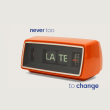
Who doesn’t love a good change? A radical haircut, a new style of clothing, changes in routine… In truth, not everyone enjoys uncertainty, but sometimes change is imperative. The same goes for brands and businesses: investing in rebranding is a crucial strategy to revitalise the image, stay abreast of the market, and stand out from the competition.
Some are quite obvious, others subtle, some controversial. In the end, the result is clear: they make people talk! In this article, we show three cases of brand rebranding that will be very familiar to you!
Ronald McDonald embraces minimalism
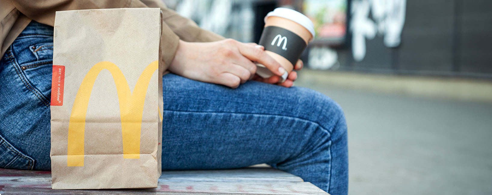
Closely associated with family, and friends, and sharing good times, McDonald’s is a beloved brand by the public. When they opted for a change, the transition to a new image and message was smooth and well-received. In addition to simplifying the logo to the unmistakable ‘M’, the brand also opted for a softening of its predominant colours, yellow and red.
The choices were not random: they sought more readability, modernity, and an image that would align with the new message focused on sustainability and health. The transformation was also evident in the expansion of menu options and the creation of more welcoming environments! And who can resist the creativity and insight of its advertisements? Despite the change, McDonald’s preserved the essence, and consumers continued to be enchanted by the magic of the creators of the Big Mac.
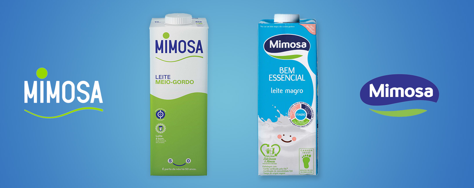
Mimosa was reborn 50 years later
While minimalism works on one hand, it’s not always well-received by the public on the other. To mark half a century of existence, Mimosa – a well-known and familiar Portuguese dairy brand – launched a new image. The oval shape disappeared, and the focus was on the name itself, in a more simplified aspect. The change was not well-received by everyone: many consumers did not identify with the new design, basing their opinion on memories, nostalgia, and an image that was once more traditional and complex.
Despite the significant visual change, the leading brand in Portugal did not let go of the slogan “It’s part of us,” which accompanies all Mimosa products. A phrase as unique and unmistakable as the old logo.
Facebook has a new META
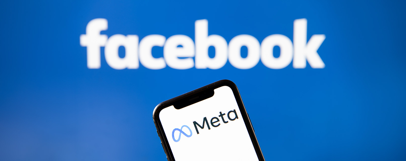
In 2021, we witnessed one of the most significant transformations in recent years in terms of rebranding. Mark Zuckerberg, CEO of Facebook, presented META, a new path for the company that also owns the well-known WhatsApp and Instagram. In addition to a major investment in Virtual Reality and the inclusion of a Metaverse, the brand changed its name, altered the logo, and opted for different typefaces.
The company’s goals and vision changed, and the identity followed suit. Signs of the times or the perfect opportunity to forget the Cambridge Analytica scandal?
The ability of a brand to adapt to an environment of constant and increasingly rapid evolution is essential. Investing in rebranding is a renewal strategy that must be carefully considered and thought out to achieve the intended objectives.
A capacidade de uma marca se adaptar a um ambiente de evolução constante e cada vez mais rápido, é essencial. Apostar num Rebranding é uma estratégia de renovação que tem de ser ponderada e pensada para atingir os objetivos pretendidos.